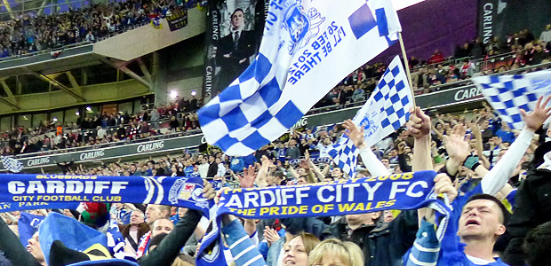

Readers of this blog will know that some time ago, I finally threw in the towel on my lifelong support of Cardiff City after one corporate rebrand too many.
Happily, I found football salvation in the lower leagues, supporting the wonderful Dulwich Hamlet FC, and now I can’t ever see me going back to the land of all seaters, sky-high prices and endless advertising.

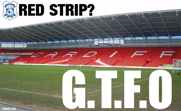
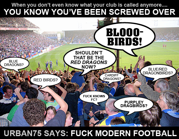
In 2012, Cardiff City’s blue strip was changed to red, in a move driven by the demands of investors. The decision split the fanbase and made a lot of people very unhappy indeed. For me it was the final straw.
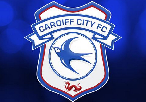
However, after meddling megalomaniac owner Vincent Tan finally caved into the relentless demands from fans to return to their traditional blue strip, a new club crest has now been revealed.
Although there’s no question it is infinitely better than his previous vanity project on branding, there’s been some curious tinkering with the Welsh Dragon.
Now relegated to a small squiggle at the foot of the crest, it looks nothing like the national emblem of Wales.
Here’s the promo guff from the Cardiff City website, where the designer desperately tries to connect the Asian ferret/dragon creation with anything to do with Wales:
The 2015 dragon was created using three distinct influences, with a view to showcasing a design that was very much unique to Cardiff City.
Projecting our Welsh heritage, the stance was taken from the national flag, as has been seen on our crest or shirt for a number of years. Celebrating Asian linked culture, design and tradition influences, we also looked to create a dragon that could be primarily owned and appreciated locally.
To achieve this the main influence was drawn from the dragon placed on top of Cardiff City Hall, as has been the case since 1904. Designed by monumental and architectural sculptor Henry Charles Fehr, the dragon has been integral to the Welsh capital for over one hundred years.
Placed at the foot of the crest, the new Cardiff City dragon gives prominence to the Bluebird, as was outlined during the return of traditional Club colours in January 2015.
I’ve no idea why a team representing the capital city of Wales should feel the need to have a crest that “celebrates Asian linked culture, design and tradition influences” – it’s just more egotistical Vincent Tan meddling, trying to twist the club’s heritage in his own image.
Not that I’ve got anything against Asia culture of course: in fact, I’m rather a fan of the style, but I’m not so keen when it’s being forced on a football club on the whim of one man.
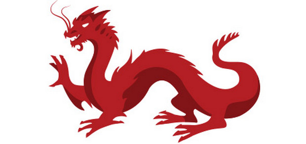
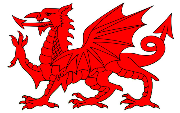
Here’s a reminder of what the Welsh Dragon actually looks like:

And here’s a red ferret:


I rest my case.
Talk about this redesign on the urban75 Cardiff City thread.
Related posts: