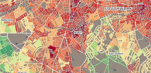
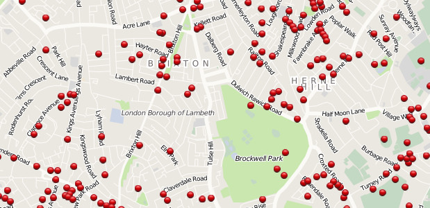
Created in the style of Charles Booth’s landmark Poverty Map, this new map covering the UK lets you view housing arranged by the Index of Multiple Deprivation or Output Area Classification.
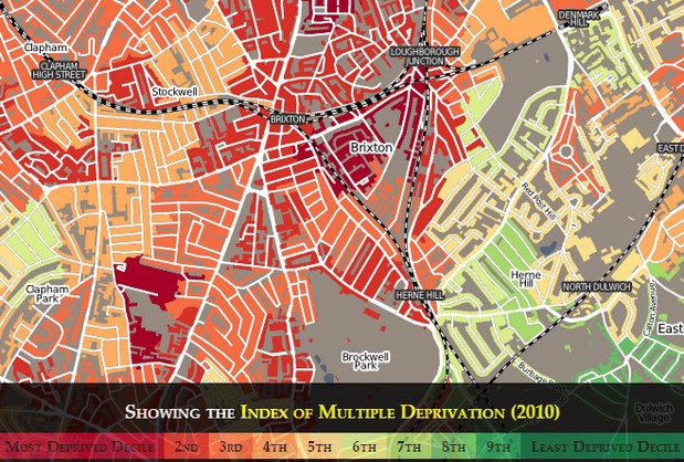
Browsing the map shows how the poor and rich can be separated by just a few streets, or sometimes be literally across the road.
Looking around Brixton, there’s large swathes of red and orange representing the most deprived areas, while a mere posh buggy ride away can be found the leafy, wealthy greens of Herne Hill and Dulwich Village.
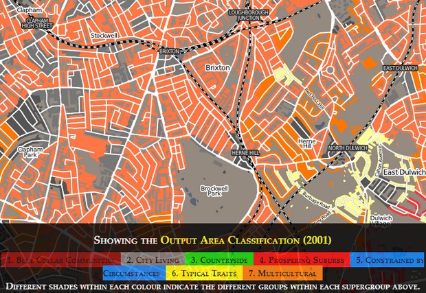
Switching to the ‘Output Area Classification’ view (which shows the differing groups), turns Brixton into a bright orange hue, representing its multicultural make up.
Browse the map here, read more about how it was created here or discuss the map on the urban75 forums.
Related posts:
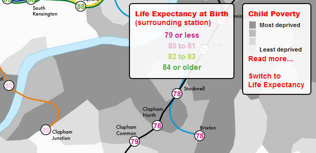 Brixton ranks low on London life expectancy rates
 The spoken languages of Brixton and the UK mapped on a fascinating interactive guide
 Brixton Costa Coffee reveals itself, while a squirrel scuttles about the Barrier Block
 Did your street get bombed in the war? View Brixton WW2 bombsites on this fascinating website
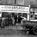 Queueing for horsemeat on Coldharbour Lane, Brixton at the Horse Flesh shop
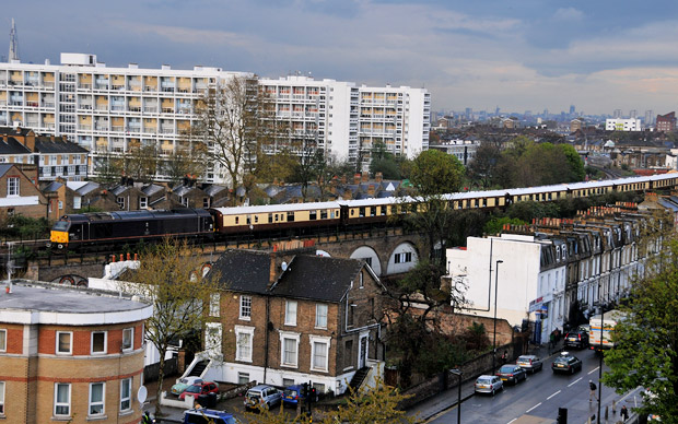 Lightning strike takes out signals: posh Pullman train stuck at signals in Brixton
 Halloween London Critical Mass ride shows solidarity with Occupy London